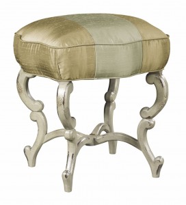
A Color for All Seasons - Ochre
Written by faith | 0
The color ochre, also spelled ocher, is one of my favorites. Early in my design career I participated in a Designer Showhouse. My challenge was the foyer, all stairs and hallways. With other designers all around my areas, I sought a color to invite, complement and add a warm contemporary feeling. My choice was ochre. Over the course of the month that the Showhouse was open to the public, I received many calls for the exact name and number of the paint.
So when I saw this photo in the latest issue of Southern Accents magazine, all my memories of that design concept refreshed in my mind. I like that this color is suited to antique and traditional elements as well as transitional contemporary styles. Whether the other designers worked with reds, burgundy, blues or greens, the ochre fit. Likewise soft blue greys, creams and ebonized wood looked rich and fresh.
This color is understated and doesn’t draw attention to itself. Not too bold so that beautiful art, rugs, flowers and all the other design elements have space for appreciation. Accents of white or black create balance when added selectively.
Possibly the biggest plus for ochre is that it flatters all skin tones so everyone invited to enjoy the space looks equally fabulous.
In this article the author notes Sherwin Williams Sunrise SW 6668 and Weekend 1029-C Martin Seynour in case you want to check it out for yourself.


