How Accurate are Trends? A Look Back at 2010
Written by faithIt’s everywhere in the news for the past weeks-design trends for 2011. This Seattle designer dives into these stories eager to hear from design gurus about the ‘next’ thing. Then it occurred to me to look back… and I located a Benjamin Moore Color Pulse, 2010. The research for the information in this Color Pulse came from data and travel in 2008-2009. And since it’s now 2011, I was curious to re-read the predictions.


Doty Horn, Director of Color and Design for Benjamin Moore
Before the color predictions comes the overriding theme that guides the color direction. In 2010, the theme was authenticity-the new counter culture. ”Known materials unite the real with valued expressions = grounded creativity - a quest for what’s true”.
Quickly I am reminded of my trip to the High Point Furniture Market April, 2010. Visible indications of ‘authenticity’ such as ‘refined graffiti’, old finishes, reinterpreted materials. Some companies do this extremely well, Phillips Collection.
And about those colors for 2010? From Doty Horn and Apartment Therapy
Greyscale: Carbon and whites that are creamy…”chalk, milk, alabaster.” Louise Nevelson textural black. And “stay tuned for ombre.” Clinically white kitchens and Valentino laser-cut white surfaces.
Naturals: “Beige competes with grey.” Parchment, cardboard, muslin and hay.
Yellows: Fresh, citron with carbon, banana, mustard, gold, sheer, gilded.
Orange: Copper, pumpkin, clay.
Reds: From pinks to crimson, brick, and a red so orange you aren’t sure if it isn’t perhaps orange. “Rouge with blue-ing, blacking. Russian red.” She called the blackened reds the most “livable” (and “wearable”). Strawberry.
Purples: “Periwinkle, grape (almost shocking), aubergine and lilac,” with the lilac neutralized so it almost reads as grey.
Blues: Soft, celestial blue, and deep “worker” blue, ink and indigo (“reflecting denim lifestyle”). She called out the deepest midnight blues for special attention.
Green: “Fresher, truer, less sage, cleaner greens to yellows. Grass is vibrant. Menthol green.” “Succotash colors: peas, corn, carrots.”
The only color missing is turquoise…which was the Pantone 2010 color of the year.
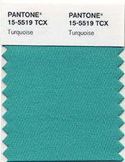
Pantone Color of the Year -2010 Turquoise
More From faithsheridan
- Combine the Best Ideas for a Guest Bedroom
- A Color for All Seasons – Ochre
- How to Welcome Guests – Must-Haves for a Guest Bedroom
faithsheridan Recommends
- Being a Philippine SEO (SEO Philippines)
- How to get on facebook at school (SEO Philippines)
