Benjamin Moore - ...Browsing by tag


Recolor Teen Boys Bedroom to Kick Off School

Written by faith | 2

My clients are busy organizing for the upcoming school year. In my Seattle interior design practice I receive lots of requests for color ideas but not as often for teen boy bedrooms. In this post I have a color scheme for a teen boy and ideas to pull it all together. This vibrant blue is a bold choice for a focal wall and the deep taupe on the side walls anchors and tones the warm rich chocolate. I think a bounce of the Sundance yellow as a lamp, beanbag chair, frame or pillow will make his room have personality. You can find suggestions and ideas like these in my newsletter.

Or, gather up to 3 images and a question about your teen bedroom and for $50 get started on a Fast Solution. Are you ready? Let’s do this!

Benjamin Moore Blueberry

Benjamin Moore Fairview Taupe

Benjamin Moore Sundance

With this color scheme in place I suggest bedcovering fabrics in a pinstripe combined with solids. I found this oxford cloth sample with wide and narrow stripes at Williams Sonoma Home . It adds an easygoing style with the style of casual men’s shirting.

Williams Sonoma Oxford Tonal-Stripe

Finally, to make this ‘teen’ and not staid, I found this area rug to place diagonally and partially under the bed or where it isn’t fully exposed.

Foreign Accents Festival Area Rug 5x7

This is a busy pattern and exposing a portion rather than the entire rug pulls the color theme together.

Share This Post

Where Do You Find Inspiration For Interior Color?

Written by faith | 0

It was exciting to tour the Portland Street of Dreams of nine penthouse condominiums nearly 2 weeks ago. As a Seattle interior designer what I especially enjoyed was seeing an interior designed by my designer colleague, Kimberlee Jaynes. In my opinion Kimberlee is superb in her color sense as you can see by the image. Choosing a color is often a daunting experience for my clients. I wanted to share what Kimberlee told me about her color inspiration for the interiors.

Living Room

Over coffee Kimberlee shared, ”The design evolved starting with a pale blue gray rug from Madison Millinger Handmade rugs. My design associate Rolfe was showing me this rug and I reached down to touch it and noticed my vermillion summer nail polish against the smoky colored rug and thought that’s it! We have our color combination!” As the design concept evolved, Kimberlee said, “Well once the artwork and pillows were in place the serene area rug had to go! The tomato area rug was a much better fit and helped to keep your eye traveling around the room.”

Benjamin Moore 1573 Castle Walls

“The vermillion colored art work and embroidered silk accent pillows help bring the living room to life.” The serene mood established with the soft blue grey continues into the bedroom as seen in this photo.

I will be speaking again with Kimberlee about some of the unique accessories she showcased in another post.

If you need help to choose a color for your project, I have a fast solution.

Subscribe to my weekly newsletter for ideas and products to ‘come home to a place you love’.

Share This Post

Part 2 Getting Started With Color: Q&A with Seattle Interior Designer Faith Sheridan

Written by faith | 0

As an Seattle interior designer and member of the Benjamin Moore Color Advisory team, color is always on my radar. I live and breath color and know how deeply it impacts how we all feel. That impact is especially relevant to our own homes and personal spaces.

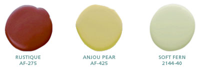
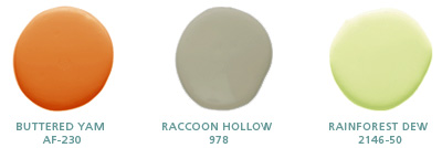
This is Part 2 of my interview with Home Savvi and I hope you enjoy the dialogue. Lately I’m attracted to the energetic shades of orange so I included a color combination below from Benjamin Moore. I like how the green softens and freshens the combo.

HomeSavvi: So we have chosen our basic driver, defined our painting project, assessed the room’s lighting, and determined our style. What’s next?

Faith: At this point, you are prepared to start putting together some color concepts for consideration. Magazines and web sites are good places to start looking at color ideas. If you are looking at a combination of styles and accessories for your room, you will get a sense for what direction you are heading into. That’s when you also begin to consider how much color intensity you want. If your inspiration color is a really bright green, you need to ask yourself how much you love it, and how much of it you want in your space. Maybe this color would be better as an accent wall, rather than an entire room that could be too overwhelming. Then make an exploratory trip to the paint store to get a paint color that is as close to your basic driver as possible. Look also for other colors that are in the same color family, colors that are part of large existing surfaces in the room that you know you’re going to keep, such as a sofa, carpet or rug.

HomeSavvi: Earlier on, we touched on how natural light changes color. What is the best way to ensure no surprises once the color is applied?

Faith: Color intensifies on the walls, so make sure you look at the saturation of the color you select. I recommend using the handy two-ounce sample testers you can find in most stores together with a disposable application tool, and go home and paint in the corners, on opposite walls, in one to two square-foot patches. Then live with it for a couple of days throughout the day, so you can see how the color changes in the sunlight in the morning, around noon and in the evening. Is the color turning too cool, or too much of a pink or orange? Then you can start eliminating some shades, and decide if you prefer lighter or darker tones.

HomeSavvi: There are many types of paints out there on the market. Which one would you recommend the most?


Faith:
If the room you are painting is a high-activity area, you will need a sturdy, washable paint. If you are environmentally conscious, you can now choose from a wide selection of eco-paints. Flat paint is a good choice because it is easy to touch up compared to paint that has sheen to it and typically needs to be completely redone. On interior walls, I especially like Benjamin Moore’s Aura (watch?v=N0eCCvxnRb8) matte / flat finish, which is exceptionally durable and suitable for all rooms, including kitchens and baths. It can camouflage small wall bumps, cracks or other imperfections since this finish does not reflect light. With only a slight hint of shine or gloss, eggshell finish is good for walls, and holds up better with cleaning than typical flat finish paint. Satin finish paint is smooth with a bit more gloss, and is most often used for windows, doors, trim or ceilings, but it can also be used as wall paint. It is particularly suitable for kids’ room walls, kitchens or bathrooms, or in high-traffic areas. Semi-gloss is most often used on doors, trim and cabinets in kitchens and bathrooms. It is easily cleaned and provides a nice, subtle shine. Gloss paint finish is almost reflective and mimics the look of enamel or plastic. It produces a dramatic look on cabinets, trim, furniture, walls and ceilings, and magnifies any surface imperfections, so careful preparation and sanding is essential before painting with high-gloss paints.

Do you need a direction to get started on a painting project? Try Fast Solutions.

More about Faith Sheridan

Share This Post

Getting Started with Color: Q&A with Seattle Interior Designer Faith Sheridan

Written by faith | 0

As an interior designer and member of the Benjamin Moore Color Advisory team, color is always on my radar. I live and breath color and know how deeply it impacts how we all feel. That impact is especially relevant to our own homes and personal spaces.

Recently, I was interviewed by HomeSavvi. The topic is a popular one that always comes up quickly in a conversation about interior design, Getting Started with Color. This post is a share of that interview, the first of two parts. And before beginning, I wanted to share one color combination that is my current inspiration.

Affinity Colors-Benjamin Moore- Rustique, Anjou Pear, Soft Fern

Choosing paint colors for an entire home remodeling project, or even just one room, can be a daunting and overwhelming task. The HomeSavvi Team took some time out to sit down with Faith Sheridan from Seattle-based Faith Sheridan Interior Design to get her input on Color 101, and help you prepare your thoughts before speaking with your remodeling professional.

HomeSavvi: Hello Faith! So what is the first thing you would recommend to homeowners when it comes to choosing color for their home?

Faith: In addition to being ready to tackle a painting project (obviously), the first thing a homeowner needs is inspiration, a color that appeals or is inviting to them. I call it the basic driver – it could be as simple as the color of a pillow, a curtain or a painting. It can also be as general as a color they enjoy wearing.

HomeSavvi: Does the space itself actually matter in the choice of a paint color?

Faith: Yes, definitely. The next step is to think about the room in question, and define the scope of the painting project a bit more. You need to determine what the room you are painting is mainly used for. Is it a room with multiple purposes with lots of wear-and-tear, or is it completely isolated and seldom used? If it is attached to another room in the house, that other room needs to be considered in the equation as well because they need to blend together as part of the home’s architectural design. The color you choose will also dictate the mood and feeling you want to capture in the space to be painted. (to be continued)

Do you need a direction to get started on a painting project? Try Fast Solutions.

More about Faith Sheridan-

Share This Post

Tips and Tricks on Ava Living

Written by faith | 0
Designing for the sexes aka remodeling with a partner
Tips and Tricks on Ava Living

http://www.avaliving.com/article.php?aid=736

Enjoy my featured article on Ava Living and tour the site. I am pleased to participate in this online community. Visit me on AvaLiving.com

Share This Post