Faith Sheridan - ...Browsing by tag


In Seattle: Designing for the Sexes aka Remodeling with a Partner

Written by faith | 0

Don’t be Sleepless in Seattle because of design differences with your partner. Here are tips from a Seattle interior designer to get started and work thru your different tastes.

Are you and your partner planning a remodel, new furnishings such as an area rug, art, accessories or window treatments? In my everyday design work, I find couples have trouble typically in SIX areas which leads to conflict and unfinished or stalled project. Here are the problem areas and remedies to resolve those design differences and get your project moving.

· Color Translating a color selection from a small sample is daunting. Plus, one partner may like bold, vibrant colors and the other soft neutrals. There are helpful websites such as www.myperfectcolor.com that show combinations. Narrow the selection and then test the colors using a mini-can on your wall first.

· Style Use magazines to identify likes and dislikes. Independently, select rooms, styles of furniture, arrangements and accessories. Then each partner can share the vision they have of the project. This is also a good opportunity to discuss the budget.

· Fabric The exchange of information from magazines shows who likes what with textures and patterns. I find one partner may prefer something floral or printed and the other plains. Use this information and decide if a floral might be on a pillow instead of a chair. Discuss smooth, soft fabrics vs. flat and also if leather is a preference.

· Television I know I will encounter strong feelings about the placement of the TV. Today the large, black screens dominate. How exposed will it be? Will it be hidden or front and center. I find most family rooms fully expose the TV as this is the gathering place for family and friends.

. Windows In the Northwest, light is very important so windows are mostly exposed. Saving furniture and fabric from excessive sunlight is a consideration so some light control is important. Heat gain and heat loss are also important. Who wants what? Again the magazine exercise is a chance to voice likes and dislikes. Do you like shades, fabric, side panels and so on.

. Clutter I generally find one partner is a neatnik and the other is less concerned with messes. I recommend drawers, baskets and boxes to keep organized. Get in the habit of clearing off surfaces daily. Group collections of objects for impact and decide which room is best for display.

The most important element of this exploration for a successful remodel is a PLAN. I work with my clients to integrate the information into a strategy of selections, finish specifications and final choices. The finished room reveals a design that is a partnership.

In my weekly enewsletter, I regularly offer resourceful sources and tips to explore as you dip your toes into a new project. Alternatively, you can receive quick solutions by email.

What works best for you readers when you design with your partner?

Part 2 Getting Started With Color: Q&A with Seattle Interior Designer Faith Sheridan

Written by faith | 0

As an Seattle interior designer and member of the Benjamin Moore Color Advisory team, color is always on my radar. I live and breath color and know how deeply it impacts how we all feel. That impact is especially relevant to our own homes and personal spaces.

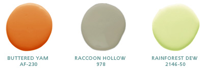
This is Part 2 of my interview with Home Savvi and I hope you enjoy the dialogue. Lately I’m attracted to the energetic shades of orange so I included a color combination below from Benjamin Moore. I like how the green softens and freshens the combo.

HomeSavvi: So we have chosen our basic driver, defined our painting project, assessed the room’s lighting, and determined our style. What’s next?

Faith: At this point, you are prepared to start putting together some color concepts for consideration. Magazines and web sites are good places to start looking at color ideas. If you are looking at a combination of styles and accessories for your room, you will get a sense for what direction you are heading into. That’s when you also begin to consider how much color intensity you want. If your inspiration color is a really bright green, you need to ask yourself how much you love it, and how much of it you want in your space. Maybe this color would be better as an accent wall, rather than an entire room that could be too overwhelming. Then make an exploratory trip to the paint store to get a paint color that is as close to your basic driver as possible. Look also for other colors that are in the same color family, colors that are part of large existing surfaces in the room that you know you’re going to keep, such as a sofa, carpet or rug.

HomeSavvi: Earlier on, we touched on how natural light changes color. What is the best way to ensure no surprises once the color is applied?

Faith: Color intensifies on the walls, so make sure you look at the saturation of the color you select. I recommend using the handy two-ounce sample testers you can find in most stores together with a disposable application tool, and go home and paint in the corners, on opposite walls, in one to two square-foot patches. Then live with it for a couple of days throughout the day, so you can see how the color changes in the sunlight in the morning, around noon and in the evening. Is the color turning too cool, or too much of a pink or orange? Then you can start eliminating some shades, and decide if you prefer lighter or darker tones.

HomeSavvi: There are many types of paints out there on the market. Which one would you recommend the most?


Faith:
If the room you are painting is a high-activity area, you will need a sturdy, washable paint. If you are environmentally conscious, you can now choose from a wide selection of eco-paints. Flat paint is a good choice because it is easy to touch up compared to paint that has sheen to it and typically needs to be completely redone. On interior walls, I especially like Benjamin Moore’s Aura (watch?v=N0eCCvxnRb8) matte / flat finish, which is exceptionally durable and suitable for all rooms, including kitchens and baths. It can camouflage small wall bumps, cracks or other imperfections since this finish does not reflect light. With only a slight hint of shine or gloss, eggshell finish is good for walls, and holds up better with cleaning than typical flat finish paint. Satin finish paint is smooth with a bit more gloss, and is most often used for windows, doors, trim or ceilings, but it can also be used as wall paint. It is particularly suitable for kids’ room walls, kitchens or bathrooms, or in high-traffic areas. Semi-gloss is most often used on doors, trim and cabinets in kitchens and bathrooms. It is easily cleaned and provides a nice, subtle shine. Gloss paint finish is almost reflective and mimics the look of enamel or plastic. It produces a dramatic look on cabinets, trim, furniture, walls and ceilings, and magnifies any surface imperfections, so careful preparation and sanding is essential before painting with high-gloss paints.

Do you need a direction to get started on a painting project? Try Fast Solutions.

More about Faith Sheridan

Seattle Interior Designer Faith Sheridan Feasts on Ferragamo Video

Written by faith | 2

As an interior designer I love great design of any and all things but shoes are a favorite. I just had to share this amazing video. This will inspire and give you goose bumps. These shoes are as timeless as good design.

from the Ferragamo Museum

OMG, this video is so fantastic, especially since I love shoes, and especially platforms! But more than that it brought back wonderful memories of a cooking school in Tuscany and a tour of the Ferragamo museum in Florence.

More about Faith Sheridan

Getting Started with Color: Q&A with Seattle Interior Designer Faith Sheridan

Written by faith | 0

As an interior designer and member of the Benjamin Moore Color Advisory team, color is always on my radar. I live and breath color and know how deeply it impacts how we all feel. That impact is especially relevant to our own homes and personal spaces.

Recently, I was interviewed by HomeSavvi. The topic is a popular one that always comes up quickly in a conversation about interior design, Getting Started with Color. This post is a share of that interview, the first of two parts. And before beginning, I wanted to share one color combination that is my current inspiration.

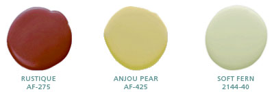
Affinity Colors-Benjamin Moore- Rustique, Anjou Pear, Soft Fern

Choosing paint colors for an entire home remodeling project, or even just one room, can be a daunting and overwhelming task. The HomeSavvi Team took some time out to sit down with Faith Sheridan from Seattle-based Faith Sheridan Interior Design to get her input on Color 101, and help you prepare your thoughts before speaking with your remodeling professional.

HomeSavvi: Hello Faith! So what is the first thing you would recommend to homeowners when it comes to choosing color for their home?

Faith: In addition to being ready to tackle a painting project (obviously), the first thing a homeowner needs is inspiration, a color that appeals or is inviting to them. I call it the basic driver – it could be as simple as the color of a pillow, a curtain or a painting. It can also be as general as a color they enjoy wearing.

HomeSavvi: Does the space itself actually matter in the choice of a paint color?

Faith: Yes, definitely. The next step is to think about the room in question, and define the scope of the painting project a bit more. You need to determine what the room you are painting is mainly used for. Is it a room with multiple purposes with lots of wear-and-tear, or is it completely isolated and seldom used? If it is attached to another room in the house, that other room needs to be considered in the equation as well because they need to blend together as part of the home’s architectural design. The color you choose will also dictate the mood and feeling you want to capture in the space to be painted. (to be continued)

Do you need a direction to get started on a painting project? Try Fast Solutions.

More about Faith Sheridan-

Seattle Designer Wants to Catch the Interior Design Tour on Wheels

Written by faith | 0

As I browsed the internet I read about this tour. I wish this interior design inspiration was visiting Seattle but the map shows a Northeast tour. It’s a clever delivery of interior design applications for small spaces and how to create drama. Since it’s so small, it’s like a studio apartment or condo thus a great way to demonstate size, scale and proportion which helps to select furniture for small spaces.

HomeGoods is an off-price home fashions store, providing a tremendous selection of high quality, unique home fashions, including brand and designer name merchandise at prices that are 20 - 60% less than finer catalog, specialty and department store prices, every day. The parent company also owns T.J. Maxx and Marshalls.

To promote their company and mix of furnishings enter HomeGoods’ Mobile Design Home, an eco-friendly, 300-square-foot space. The house on wheels, which has been traveling along the East coast for several weeks, showcases a living room, kitchen, bedroom and sitting area that feature a mix of styles.

From Apartment Therapy

Living Room area from Apartment Therapy

Spokeswoman Robyn Arvedon explained the living room was designed around the deep purple, bright pink and lime green colors in the throw pillows arrayed on a neutral-hued sofa. The neutral shade of the sofa is further offset by a fuchsia carpet and green and pink chairs. Exotic touches add interest in the form of colorful perfume bottles from India displayed on a circular table, an Asian garden stool and tables. “You don’t have to pigeonhole yourself into a color palette,” Ms. Arvedon explained. “The core of the theme here is to have fun.”

The HomeGoods’ team’s message, “no fear.” Decorate with color and use different styles. Seek an inspiration to get started and build on it. It’s all about making a personal statement.